Check out an extract of my design portfolio.
„The most important thing in communication is to hear what isn’t being said.“
– Peter Drucker
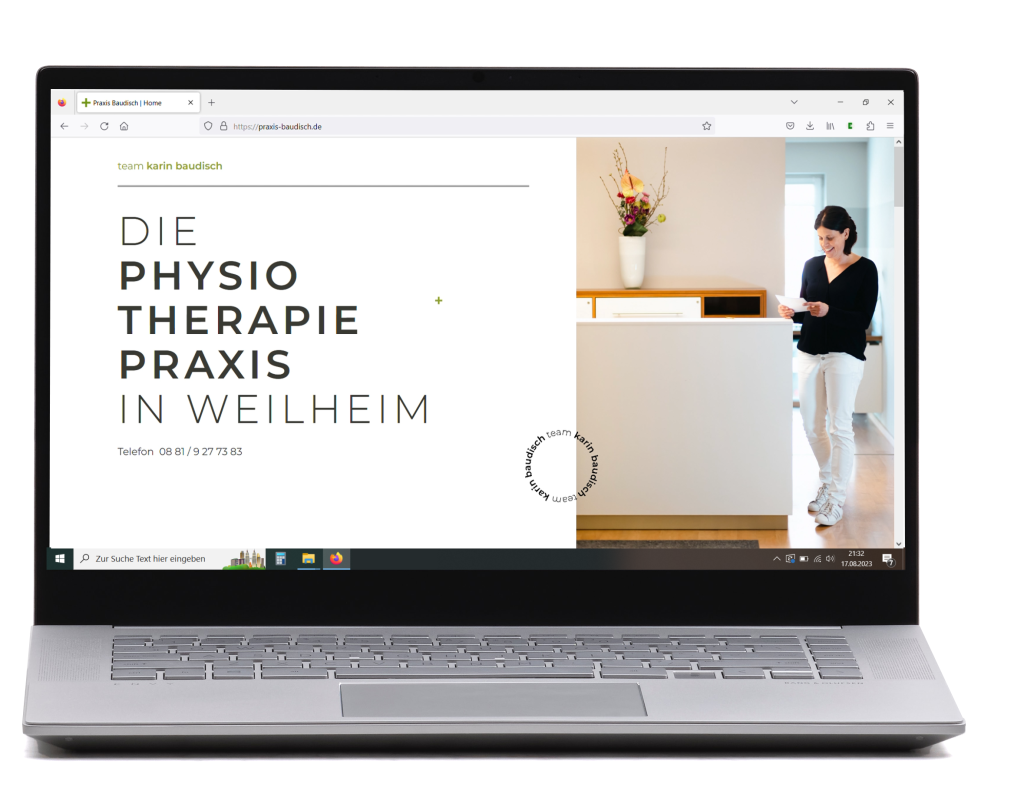
Webdesign "team karin baudisch"
This webdesign was created for the physiotherapy practice „team karin baudisch“ in Weilheim, Germany.
Requested was a design with a modern, clean and timeless appearance. The focus lies on images and well chosen keywords that share an impression of their offer and way of working. All necessary information is found easily – no matter of the technical affinity a customer might have.

Logodesign
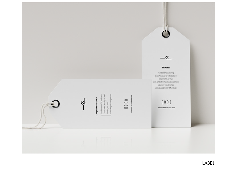
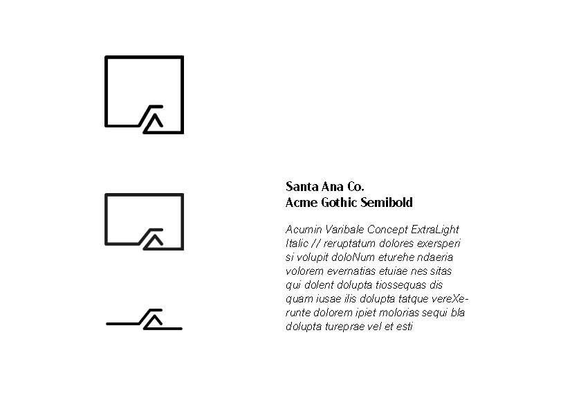
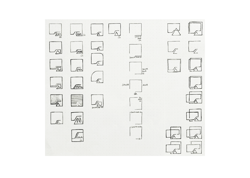
This project was about developing a logo for a backpackbrand which protects your longboard during travel and gives you an option to carry it on your back. It‘s supposed to become a high class brand within the scene and to stand out concerning quality and style.
Context
The logo is representing the „S“ and the „A“ of Santa Ana Co. in an slightly abstract matter. While the „S“ is appearing to almost even protect the „A“, it gives the logo the protective and caring atmosphere that the backpack is offering to its content. Another association can be a rail of a stairway which is a common object in the world of skateboarding. The „A“ itself can be standing for a mountain – a place where one of the longboarding disciplines is carried out. With its simple, rounded and modern shapes the logo is both friendly but also high quality and reaching the main target group of people within their thirthies.

Customer
Santa Ana Co.
Technology
Adobe AI // PS
Sector
Sports
Skills
Creation
Magazine Cover
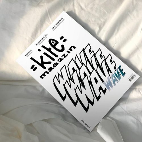
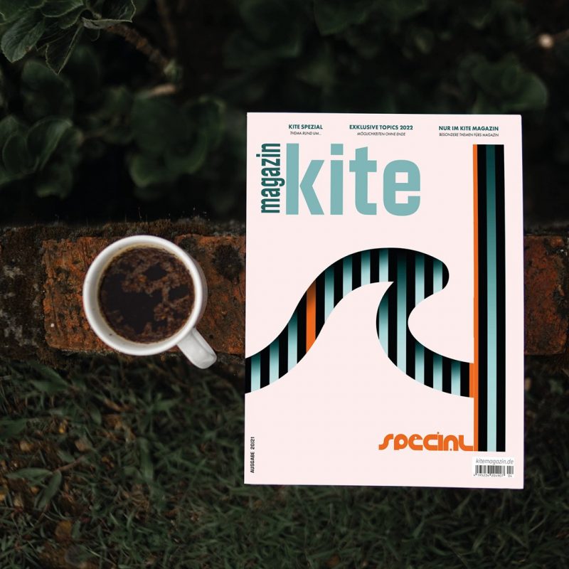
Kiteanddesign is very proud to publish an exclusive selection of some brandnew interpretations of a kite magazine cover. The theme of this project was obviously set on the topic „waves“. As the typical magazine for kitesurfers is usually covered by a cool and sleek trick-shot, this design will help to stand out in the magazine rack. Furthermore there is a huge chance in reaching out for a new and upcoming target group of kitesurfers.
3D-modell + Rendering
Inflatable eventtents of XGLOO are an easy, light and comfortable option to create a protected area for your event or any other occasion.
The above shown rendering is an extract of the very modular tent portfolio of XGLOO and was created for their onlineshop. Renderings of the tent and its parts are now used in a configurator to support customers with a visionary impression of their order and to display the product on the website. From building the 3D-modell in scale 1:1 with all its details and modular pieces up to the design of the renderings it was my task to create a visual impression of the rendered product. Moreover I contributed in making the product even better than it is already.
Check out the tent at the XGLOO configurator.
Customer
XGLOO
Technology
CAD + Keyshot
Sector
Eventtents
Skills
Rebuilding
Do You like what you have seen?
So let's start with your project!
daniela@kiteanddesign.com
+49 174 808 1401
© 2023 kiteanddesign. The copyright of text, images and videos belongs to kiteanddesign and is subject to different license terms.
Usage is only permitted after explicit approval of kiteanddesign.
